Adventures in Scene Referred Space – Part Four
Recap
Welcome back to my series of tutorials on generating a Display Referred Space (DRS) to Scene Referred Space (SRS) color transform for your humble consumer camera. If you’ve dropped in here, be sure to at least read my last blog post to catch up. This series is aimed at VFX artists on a budget looking for the highest quality results with non-specialist equipment.
Working in SRS will help you create more convincing, more accurate CG integration with background plates and remove much of the compositing guesswork of a DRS workflow. In this post we’ll take the data we captured from our camera and use some math to build a nice smooth response curve to generate a 1D LUT (Look Up Table) that will be used as a color transform in our favorite 3D package or compositor. For more on LUTs, this post provides a good primer.
Remember, we only captured a limited series of data points from our camera. This exercise is to extrapolate a much more usable set. A typical 1D LUT uses 4096 data points to provide the granularity needed for compositing and color grading. In the last exercise we captured less than 30.
Take a breath
Okay, first up, I’ll be the first to say I didn’t become a CG artist to spend time with spreadsheet formulas, but remember CG is the meeting of science and art. Math was never my strong suite at school, so trust me when I say, take this slowly and with a little patience and perhaps some head scratching you’ll get through this. If I managed it, I think you can too. If this comes as a breeze, good for you. This post is aimed at artists first and foremost who rarely get into the scientific meat.
I’m going to take you through this exercise in Google Sheets, but if you’re more comfortable working in Excel or a similar package, feel free. The critical feature that’s needed is the ability to support curve fitting.
Follow along with my example sheet. It’s helpful to keep it open in a second browser window and note that some cells have comments attached to them indicated by a small yellow triangle. Hover over these for additional info. The sheet is un-editable but consider making a copy to your Google Drive using
File > Make a copy...Normalizing your results
We ended the last blog post with a series of RGB values captured from your camera in ⅓ stop increments, above and below perfect exposure by four stops or so.
In my case I captured 23 results before I bottomed out at RGB 0,0,0 or hit the upper limit of RGB 255,255,255. These are shown on tab 1 of my sheet. I’ve gone ahead and plotted a line chart from those results. This chart is not necessary for our end goal but gives us an early preview of how my Nikon D5200’s sensor responded to light with the stock lens and a flat color profile shooting video at ISO 100. More on creating charts later.

Tab 1 of my sheet. My exposure and RGB results plus a plotted line chart for reference. Note the slight variance in RGB values around -3 stops.
Go ahead and delete your exposure values in column A or duplicate them into a new column or – better yet – a new tab, you don’t need them anymore. You just needed to know how many of them you were able to capture.
The next step is to normalize that exposure range into a zero-to-one framework. We use a simple sheet formula to generate a list of results from 0-1. The following assumes the first row in your sheet is discounted (in mine it contains text headers to keep things clear). Replace the row number range according to your results. Again, in my case I had 23 results, thus:
=ARRAYFORMULA((ROW(A2:A24) - 2) /(ROWS(A2:A24) - 1)) Next, paste the formula in cell A2. The formula will automatically populate the remaining rows, like so:

The exposure values have been normalized to a 0-1 range.
Next you’ll want to also normalize your RGB values to a 0-1 range freeing them of their 8-bit trappings. The approach here is slightly different. In this case you can’t delete the information you captured, you’ll need three new columns for the normalized RGB conversion. These could be in the same sheet but I find it helpful to set up a new tab (In my case tab 2) and have brought over my normalized EV into column A of that sheet. Like tab 1 I’ve set up columns B,C, and D to represent R,G, and B respectively.
Google sheets allows you to reference data in the cells in one sheet (by sheet name) and then duplicate it into new cells. Here’s an example of the formula:
=ARRAYFORMULA(SORT('Name of referenced tab'!B2:B24/255, ROW(B2:B24),))In the above example Column B assumes column B (RGB,R) in both the referenced and new tabs. The “/255” part normalizes those numbers into a 0-1 range, and the final “ROW” component tells the formula which rows to spit the results into. Once again you’ll need to adjust row letter and numbers according to your results and sheet layout.
As with the EV normalization, it’s just a matter of pasting the appropriately edited formula into the first cell of each of R, G, and B columns and the formula will populate the remaining rows.
Here are the results on my new tab:

Tab 2: Normalized EV, R,G and B results. Note the formula used for column D.
Okay, we’ve got some decimal points there and we’ve freed ourselves of the RGB limitations of 0-255 from our 8-bit camera file. Those are two small steps toward the granularity we need to build our LUT, and SRS but we can do better.
Getting exponential
You’re probably familiar with the ability to format numbers in a spreadsheet to a few typical choices like currencies or to a couple of decimal points. Google sheets allows us to use a custom format. You’ll find this under:
Format > Number > More Formats > Custom Number Formats…We’ll use the following custom number format to format our normalized A column:
0.00000000000E+0The E tells us that this is an exponential number. For the non-scientific among us, it basically means there are a lot of decimal points in this number giving us terrific granularity and accuracy.

A view of the custom number format menu.
Select your A,B,C, and D columns, enter the number format into the custom number format box and hit Apply. Your results should now look something like this:

Tab 2: Our normalized results have now been given extra exponential granularity
And with that, the normalization part is complete. Made it this far? Great, take a break.
Getting Mean
Remember when we used the ink dropper tool in the previous blog post to capture the RGB values for each exposure? I mentioned at that point that if you're not correctly white balanced, it may be that your values separate slightly at some point in the range. If your RGB values lined up exactly across every reading, give yourself a gold star and skip this step.
In my case, if you look back at the first line chart at the top of this post you can see where the R,G, and B separate slightly around 2 to 3 stops below my camera's "middle gray". Given 1D LUTs as opposed to 3x1D or even 3D LUTs can only take one input and give one output we need to find some common ground between our RGB values, we’ll use a mathematical function to do this. It’s not ideal but given we’re already working with limitations, it’s considered “good enough”.
Add a fifth column, column E. You’ll use this to spit out a Geometric mean of your normalized RGB values giving a single set of value you can use to build your 1D LUT. If you feeling bold, learn more about Geometric Means here, or dive straight into the formula:
=GEOMEAN(Bx, Cx, Dx)Unlike our previous formulas, you’ll need to add the formula to each valid row, incrementing the x accordingly, e.g. B3,C3,D3 down to B24,C24,D24. Note, that for row A2,B2,C2 (assuming the row above per my example is simply a set of text headers) you can skip the formula and just enter 0,0,0 because the GEOMEAN function will spit out an error if it attempts to find the Geometric Mean of three zeroes.
Once again, here are my results, and yes, go ahead and format the new column with the exponential format:
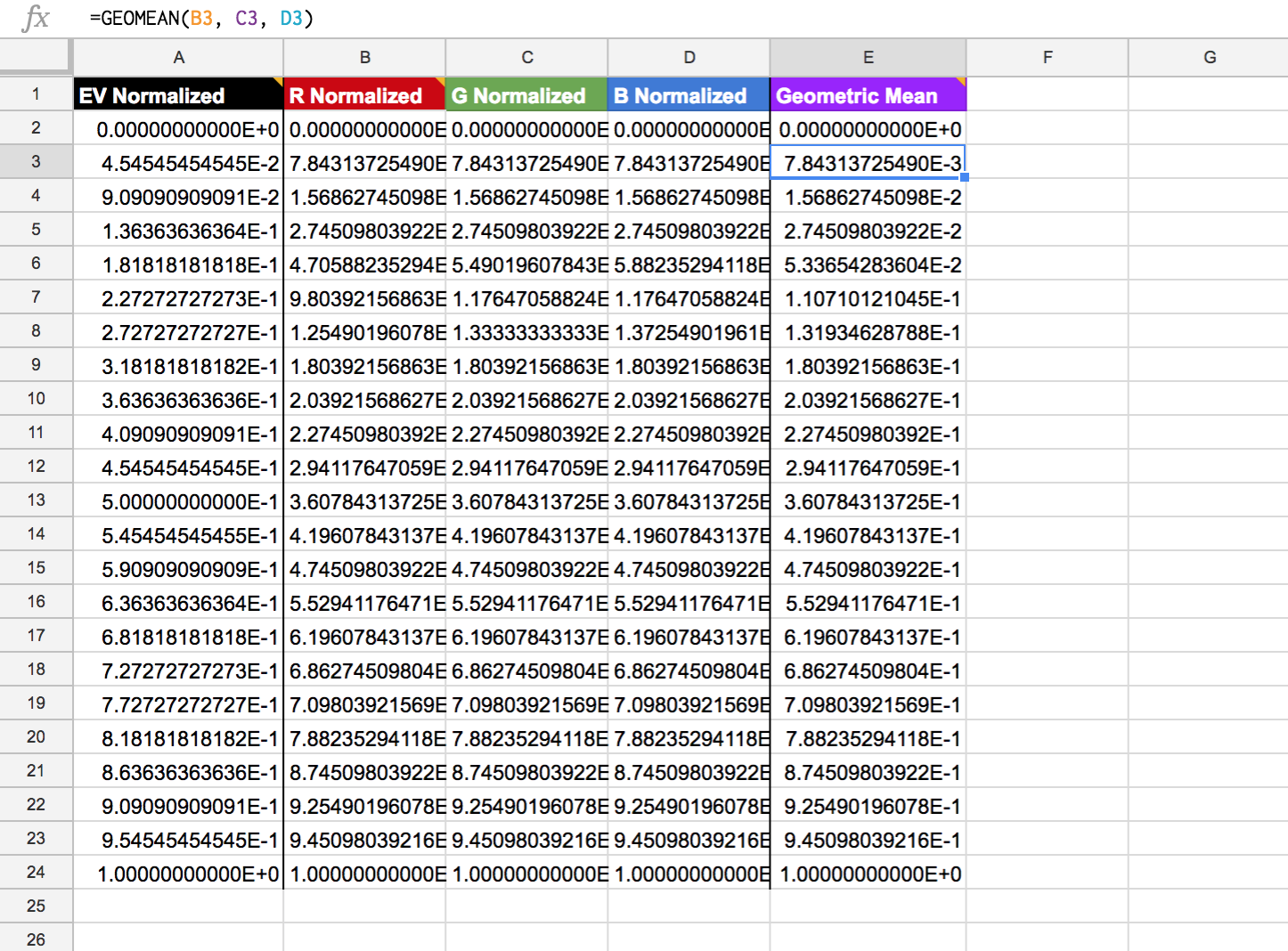
Geometric Mean results find a common value between slightly different R,G and B values.
Fitting Curves
With the grunt work out the way, now comes the fun part. We’re going to use a “curve fitting” formula to extrapolate our data into something that we can use to build a 4096 value LUT. Unlike the line graph shown in the first screenshot in this post, a fitted curve gives us much more accurate transitional data between recorded data points. Think of this just like using bezier curves in CG animation: plot two points and the curve does the “tweening”. Our mathematical curve will provide the values be”tween” our gray card results.
In Google Sheets, the ability to generate a fitted curve lies in the chart construction functionality. If you’re like me this may be the first time you’ve generated a chart in Sheets, so I’ll walk you through this as slowly as I can.
First step is:
Insert > ChartThe “Chart Editor” drawer will then slide out ready for input and may suggest some inputs based on the data in your current sheet.
In the “Data” tab of the Chart Editor, under “Chart Type” choose “Scatter Chart”, something you’ll likely remember from High School.
Next you need to tell it which “series” to use to build the chart. For the X-axis feed it your normalized EV range, column A. In my case A2:A23. When it asks “What data?” remember you can simply drag and drop the range in the sheet to grab the row numbers.
For the Y-axis you need to tell it to pick either your Geomean column or – if you didn’t need the Geomean – any one of your R,G, or B ranges given they are identical.
Your chart should look something like this: at first glance simply a scatter version of the line graph I previewed earlier.
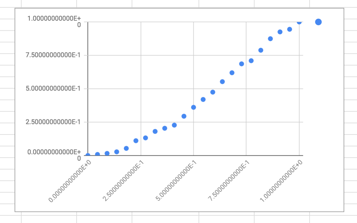
The initial state of the scatter chart.
Next, move to the “Customize” tab of the Chart Editor. Here you can set up the look of your chart, including how data points are displayed, the title, the values on X and Y, etc. But what matters to us is that this is where the curve fitting lives.
Under the “Series” rollout, check the box titled “Trendline”. New options will appear below the checkbox and an initial linear line will be applied to your graph. That’s a start but as fitted curves go it’s not our best fit.

The initial linear “fitted curve” is not yet a great fit to our gray card data.
Under the new option for Trendline “Type” choose “Polynomial” from the dropdown. This may not end up being the curve fit you need but it’s likely a small improvement over the initial linear curve. The trendline will now change and should visually fit better to your plotted scatter points, but is likely still not a great fit.
Next, under “Polynomial Degree”, change the value from “2” to “4” - and bingo, with my results, I get a nice fitted curve that echoes and builds upon my captured data and smooths out the slight RGB variance I'd recorded:

A 4th degree Polynomial fitted curve fits my camera data nicely.
Your camera results may need a different curve fit, so try some different options under the Trendline “Type” until you get something that works, but in most cases a 4th degree Polynomial should suffice. These trendline types are, of course, unique mathematical formulas. The chart is simply using that formula to create a graphic visualization of the results.
Our final step under the Trendline options is to choose “Use Equation” under “Label”. This will reveal the hidden formula to us, the gold that this exercise has been digging for.
Your curve fit formula will be unique. Here’s mine:
-4.83E-03 + 0.217x + 0.681x^2 + 1.25x^3 + -1.15x^4This is the key that builds your LUT on the 3rd tab…
The Look of LUT
Now, to build our LUT. This third tab is relatively straightforward. This time there are deliberately no explanatory text headers in the first row because we’ll be cutting and pasting this LUT at a later point.
Set up your tab to contain 4096 rows. Now here’s the important part: we want to take advantage of Google Sheets’ named range feature. You’ll find this under the menu:
Data > Named ranges…The Named ranges drawer will slide out. Add a range, select the entire column A, and, give it a name (in my case “Linear”) and hit Ok. You can now easily reference A1:A4096 with one simple name.
Now let’s populate Column A with a normalized 0-1 range over 4096 entries. Once again, it’s just a matter of a formula in the first cell, A1:
=ARRAYFORMULA( (ROW(Linear) - 1) / (ROWS(Linear) - 1) )The second column breaks down your fitted curve into 4096 entries using the resultant chart formula and the normalized named range of A1:A4096. In my case:
=ARRAYFORMULA(-0.00483 + 0.217*Linear + 0.681*Linear^2 + 1.25*Linear^3 + -1.15*Linear^4)See the similarity with the curve fit formula that appeared when we used “Choose equation” under the chart “Customize” tab a few moments ago? Of course, you'll have to adjust yours accordingly:
-4.83E-03 + 0.217x + 0.681x^2 + 1.25x^3 + -1.15x^4Yup, that’s it. A unique fitted curve extrapolating the handful of data points you captured with your camera and gray card into a 4096 entry LUT. One last step remains and that is to format both columns to our exponential number format. On my sheet I’ve included a chart that echoes the curve fitted LUT compared to a linear line. This can be a handy confirmation that everything worked to plan.

The LUT tab.
You now have the raw data needed to build your LUT and in my next blog post you’ll see that’s a very straightforward process. Once again, remember this LUT is unique to your camera, lens, ISO and any LOG or Flat curve used at the time of the gray card exercise. We’ll be using this LUT as a color transform for both converting our camera footage from DRS into SRS and compositing CG into background video plates shot with this unique camera recipe.
Wrap Party
If you’ve made it this far, give yourself a pat on the back. For the mathematically un-inclined, the trickiest part is behind you, though you’ll want to repeat both the gray card capture and this spreadsheet exercise for any other camera recipe you anticipate shooting with. Once again, I can’t stress enough, if the camera, lens, ISO, or color profile in your camera settings change, you’ll need to use a different LUT during compositing.
In the next post we’ll spin out a LUT from your results (barely more than a text file) and use the final tab of the spreadsheet to generate an OpenColorIO (OCIO) config entry for the LUT.
From there we’ll leverage OCIO's color management tools to convert our footage from its initial Display Referred Space state into a 32bit Scene Referred Space image sequence. In short, getting us to an approximation of a pro cine-camera workflow with a consumer camera and readying the footage for alignment with Scene Referred CG elements.
Thanks
If you’ve found this post hopeful, please consider following me on Twitter for updates on future posts.
Once again, a huge thanks must go to Troy Sobotka, industry veteran, and the brain behind Filmic Blender (standard in Blender as of version 2.79) who first walked through me this approach so that I may share it with you. Be sure to follow him on Twitter.
Cover image by Craig Chew-Moulding used under Creative Commons licensing.